Rule of thirds for Powerpoint
16 Aug 2006Just a thought I had:
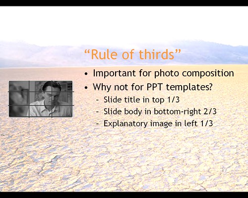
if the “rule of thirds” is so effective for photo composition, could it also be used to create more pleasing Powerpoint presentation designs?
An example of the layout dimensions could be like this (don’t focus on the boring picture/font, just the relative placement):
Well, it has been recently discussed on Presentation Zen, with some really nice pictures. However, judging by the standard templates in Powerpoint, the people at the ‘Microsoft Office Powerpoint’ team are not yet aware of this rule and other design principles.
Keep in mind, this is just a tiny make-up aspect of a presentation. There are more important issues like, … erm, content:
Presentations largely stand or fall on the quality, relevance, and integrity of the content. If your numbers are boring, then you’ve got the wrong numbers. If your words or images are not on point, making them dance in color won’t make them relevant. Audience boredom is usually a content failure, not a decoration failure.
from Powerpoint is evil
and
- Use a lot of slides. Change them rapidly.
- The slides go with the words–they aren’t just there as backdrops.
- The slides are NOT the words. They represent the idea you’re talking about, either directly or emotionally.
from Kathy Sierra