New beta YouTube layout
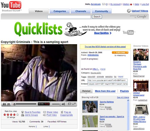
14 Jun 2007This is what a YouTube clip page looks like now:

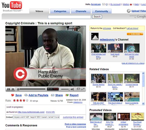
And this is what YouTube is developing as a new ‘beta’ version:

- they got rid of the large banner (” Use Quicklists!”) which was basically a waste of space.
- all clip info is now under the video instead of to the right. All info on and action on a video are now in one place. I like it.
- Youtube likes you to check out other videos. Most newly freed space is dedicated to thumbnails of other (‘related’/’promoted’) clips: you now see 13 of them on the frist page instead of 5.

